Data analyzes II - data visualization and analyses#
Edited by Yury Markov (he/him)
Peer Herholz (he/him)
Habilitation candidate - Fiebach Lab, Neurocognitive Psychology at Goethe-University Frankfurt
Research affiliate - NeuroDataScience lab at MNI/McGill
Member - BIDS, ReproNim, Brainhack, Neuromod, OHBM SEA-SIG, UNIQUE
![]()
![]() @peerherholz
@peerherholz
Before we get started …#
most of what you’ll see within this lecture was prepared by Ross Markello, Michael Notter and Peer Herholz and further adapted for this course by Peer Herholz
based on Tal Yarkoni’s “Introduction to Python” lecture at Neurohackademy 2019
based on 10 minutes to pandas
Objectives 📍#
learn basic and efficient usage of python for data analyzes & visualization
working with data:
reading, working, writing
preprocessing, filtering, wrangling
visualizing data:
basic plots
advanced & fancy stuff
analyzing data:
descriptive stats
inferential stats
Recap - Why do data science in Python?#
all the general benefits of the
Python language(open source, fast, etc.)Specifically, it’s a widely used/very flexible, high-level, general-purpose, dynamic programming language
the
Python ecosystemcontains tens of thousands of packages, several are very widely used in data science applications:Jupyter: interactive notebooks
Numpy: numerical computing in Python
pandas: data structures for Python
pingouin: statistics in Python
statsmodels: statistics in Python
seaborn: data visualization in Python
plotly: interactive data visualization in Python
Scipy: scientific Python tools
Matplotlib: plotting in Python
scikit-learn: machine learning in Python
even more:
Pythonhas very good (often best-in-class) external packages for almost everythingParticularly important for data science, which draws on a very broad toolkit
Package management is easy (conda, pip)
Examples for further important/central python data science packages :
Web development: flask, Django
Database ORMs: SQLAlchemy, Django ORM (w/ adapters for all major DBs)
Scraping/parsing text/markup: beautifulsoup, scrapy
Natural language processing (NLP): nltk, gensim, textblob
Numerical computation and data analysis: numpy, scipy, pandas, xarray
Machine learning: scikit-learn, Tensorflow, keras
Image processing: pillow, scikit-image, OpenCV
Plotting: matplotlib, seaborn, altair, ggplot, Bokeh
GUI development: pyQT, wxPython
Testing: py.test
Widely-used#
Python is the fastest-growing major programming language
Top 3 overall (with JavaScript, Java)

What we will do in this section of the course is a short introduction to Python for data analyses including basic data operations like file reading and wrangling, as well as statistics and data visualization. The goal is to showcase crucial tools/resources and their underlying working principles to allow further more in-depth exploration and direct application.
It is divided into the following chapters:
Here’s what we will focus on in the second block:
Recap - What kind of data do I have and where is it#
The first crucial step is to get a brief idea of the kind of data we have, where it is, etc. to outline the subsequent parts of the workflow (python modules to use, analyses to conduct, etc.). At this point it’s important to note that Python and its modules work tremendously well for basically all kinds of data out there, no matter if behavior, neuroimaging, etc. . To keep things rather simple, we will keep using the behavioral dataset from last session that contains ratings and demographic information from a group of university students (ah, the classics…).
We already accomplished and worked with the dataset quite a bit during the last session, including:
reading data
extract data of interest
convert to different more intelligible structures and forms
At the end, we had two dataframes, both containing the data of all participants but in different formats. Does anyone remember what formats datasets commonly have and how they differ?
True that, we initially had a dataframe in wide-format but then created a reshaped version in long-format. For this session, we will continue to explore aspects of data visualization and analyzes via this dataframe. Thus, let’s move to our data storage and analyses directory and load it accordingly using pandas!
from os import chdir
chdir('C:/Users/ika_m/OneDrive - Johann Wolfgang Goethe Universität/Documents/test_data')
from os import listdir
listdir('.')
['AG_01_02_stroop_2025-01-23_13h12.02.354.csv',
 'BF_31_01_stroop_2025-01-23_12h25.25.690.csv',
 'BF_31_02_stroop_2025-01-23_13h12.43.710.csv',
 'data_experiment',
 'FB_09_02_stroop_2025-01-23_13h12.14.223.csv',
 'FB_09_03_stroop_2025-01-23_13h30.49.889.csv',
 'FK_24_01_stroop_2025-01-23_12h36.23.128.csv',
 'JB_22_01_stroop_2025-01-23_12h29.58.313.csv',
 'JB_22_02_stroop_2025-01-23_13h13.20.521.csv',
 'JB_22_03_stroop_2025-01-23_13h32.52.317.csv',
 'XY_16_03_stroop_2025-01-23_13h31.18.706.csv']
listdir('data_experiment/preprocessing')
['AG_01_02clean.csv', 'cleaned_df_group.csv']
import pandas as pd
df_long = pd.read_csv('data_experiment/preprocessing/cleaned_df_group.csv')

df_long.head()
| participant | session | date | expName | psychopyVersion | OS | frameRate | resp.keys | resp.corr | resp.rt | ... | trials.thisRepN | trials.thisTrialN | trials.thisN | trials.thisIndex | trials.ran | text | letterColor | corrAns | congruent | trial_number | |
|---|---|---|---|---|---|---|---|---|---|---|---|---|---|---|---|---|---|---|---|---|---|
| 0 | AG_01_02 | 1 | 2025-01-23_13h12.02.354 | stroop | 2023.1.3 | MacIntel | 20.408163 | left | 1.0 | 0.635 | ... | 0.0 | 0.0 | 0.0 | 5.0 | 1.0 | blue | red | left | 0.0 | 1 |
| 1 | AG_01_02 | 1 | 2025-01-23_13h12.02.354 | stroop | 2023.1.3 | MacIntel | 20.408163 | down | 1.0 | 0.342 | ... | 0.0 | 1.0 | 1.0 | 2.0 | 1.0 | green | green | down | 1.0 | 2 |
| 2 | AG_01_02 | 1 | 2025-01-23_13h12.02.354 | stroop | 2023.1.3 | MacIntel | 20.408163 | left | 0.0 | 0.641 | ... | 0.0 | 2.0 | 2.0 | 1.0 | 1.0 | red | green | down | 0.0 | 3 |
| 3 | AG_01_02 | 1 | 2025-01-23_13h12.02.354 | stroop | 2023.1.3 | MacIntel | 20.408163 | right | 1.0 | 1.076 | ... | 0.0 | 3.0 | 3.0 | 3.0 | 1.0 | green | blue | right | 0.0 | 4 |
| 4 | AG_01_02 | 1 | 2025-01-23_13h12.02.354 | stroop | 2023.1.3 | MacIntel | 20.408163 | right | 1.0 | 0.680 | ... | 0.0 | 4.0 | 4.0 | 4.0 | 1.0 | blue | blue | right | 1.0 | 5 |
5 rows × 21 columns
Recap - What is the goal of the data analyzes#
There obviously many different routes we could pursue when it comes to analyzing data. Ideally, we would know that before starting (pre-registration much?) but we all know how these things go… For the dataset we aimed at the following, with steps in () indicating operations we already conducted:
(read in single participant data)
(explore single participant data)
(extract needed data from single participant data)
(convert extracted data to more intelligible form)
(repeat for all participant data)
(combine all participant data in one file)
(explore data from all participants)
(general overview)
basic plots
analyze data from all participant
descriptive stats
inferential stats
Nice, that’s a lot. The next step on our list would be data explorations by means of data visualization which will also lead to data analyzes.
Recap - how will the respective steps be implemented#
After creating some sort of outline/workflow, we though about the respective steps in more detail and set overarching principles. Regarding the former, we also gathered a list of potentially useful python modules to use. Given the pointers above, this entailed the following:
pingouin and statsmodels for data analyzes/stats
Regarding the second, we went back to standards and principles concerning computational work:
use a dedicated computing environment
provide all steps and analyzes in a reproducible form
nothing will be done manually, everything will be coded
provide as much documentation as possible
Important: these aspects should be followed no matter what you’re working on!
So, after “getting ready” and conducted the first set of processing steps, it’s time to continue via basic data visualization.
Basic data visualization#
Given that we already explored our data a bit more, including the basic descriptive statistics and data types, we will go one step further and continue this process via basic data visualization to get a different kind of overview that can potentially indicate important aspects concerning data analyses. As mentioned above, we will do so via the following steps, addressing different aspects of data visualization. Throughout each, we will get to know respective python modules and functions.
Underlying principles#
When talking about visualization one might want to differentiate data exploration and analyses but one can actually drastically influence the other. Here, we are going to check both, that is facilitating data understanding in many ways and creating high quality results figures.
Unsurprisingly, python is nothing but fantastic when it comes to data visualization:
pythonprovides a wide array of optionsLow-level and high-level plotting
APIsstatic
imagesvs.HTMLoutput vs.interactive plotsdomain-general and domain-specific packages
optimal visualization environment as it’s both efficient and flexible
produce off-the-shelf high-quality plots very quickly
with more effort, gives you full control over the plot
While python has a large amount of amazing modules targetting data visualization, we are going to utilize the three most common and general ones, as they provide the basis for everything else going further:
The first two produce static images and the last one HTML outputs and allow much more interactive plots. We will talk about each one as we go along.
matplotlib#
the most widely-used
pythonplotting libraryinitially modeled on
MATLAB’s plotting systemdesigned to provide complete control over a
plot
matplotlib and all other high-level APIs that build upon it operate on underlying principles and respective parts:

In the most basic sense matplotlib graphs your data on Figures (e.g., windows, Jupyter widgets, etc.), each of which can contain one or more Axes, an area where points can be specified in terms of x-y coordinates (or theta-r in a polar plot, x-y-z in a 3D plot, etc.).
figuresthe entire
graphickeep track of everything therein (
axes,titles,legends, etc.)
axesusually contains two or three
axis objectsincludes
title,x-label,y-label
axisticksandtick labelsto providescalefordata
artisteverything visible on the
figure:text,lines,patches, etc.drawn to the
canvas
A bit too “theoretical”, eh? Let’s dive in and create some plots!
But before we start, two important points to remember: when plotting in jupyter notebooks, make sure to run the %matplotlib inline magic before your first graphic which results in the graphics being embedded in the jupyter notebook and not in the digital void. (NB: this is true for most but not all plotting modules/functions.)
%matplotlib inline
When using matplotlib you can choose between explicitly creating Figures and axes or use the plt interface to automatically create and manage them, as well as adding graphics. Quite often you might want to use the latter.
import matplotlib.pyplot as plt
standard plots#
Obviously, matplotlib comes with support for all the “standard plots” out there: barplots, scatterplots, histograms, boxplots, errorbars, etc. . For a great overview on what’s possible, make sure to check the gallery of the matplotlib documentation. For now, we are going to start simply…how about some univariate data visualization, e.g. a scatterplot?
import numpy as np
# We don't have age in original dataset, so we will generate a random age for each unique participant
np.random.seed(42)  # For reproducibility
participant_ages = (
    df_long[['participant']]
    .drop_duplicates()
    .assign(age=np.random.randint(18, 66, size=df_long['participant'].nunique()))
)

# Map ages back to df_long
df_long = df_long.merge(participant_ages, on='participant', how='left')
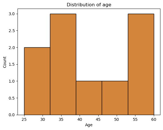
For example, we are interested in the distribution of age in our dataset. Using matplotlib, we need to create a figure and draw something inside. As our data is in long-format we have to initially extract a list containing the age of each participant only once, using drop_duplicates method
plt.figure(figsize=(10, 5))
plt.hist(df_long.drop_duplicates(subset='participant')['age'])
plt.show()
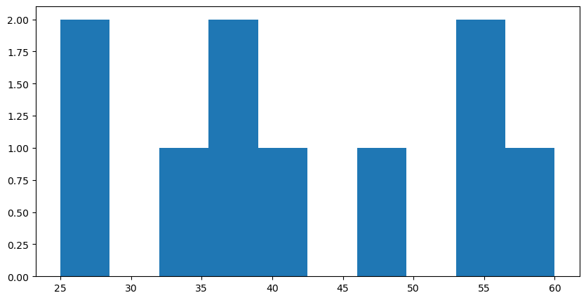
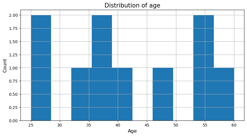
While the information we wanted is there, the plot itself looks kinda cold and misses a few pieces to make it intelligible, e.g. axes labels and a title. This can easily be added via matplotlib’s plt interface.
plt.figure(figsize=(10, 5))
plt.hist(df_long.drop_duplicates(subset='participant')['age'])
plt.xlabel('Age', fontsize=12)
plt.ylabel('Count', fontsize=12)
plt.title('Distribution of age', fontsize=15);
plt.show()

We could also add a grid to make it easier to situate the given values:
plt.figure(figsize=(10, 5))
plt.hist(df_long.drop_duplicates(subset='participant')['age'])
plt.xlabel('Age', fontsize=12)
plt.ylabel('Count', fontsize=12)
plt.title('Distribution of age', fontsize=15)
plt.grid(True)
plt.show()
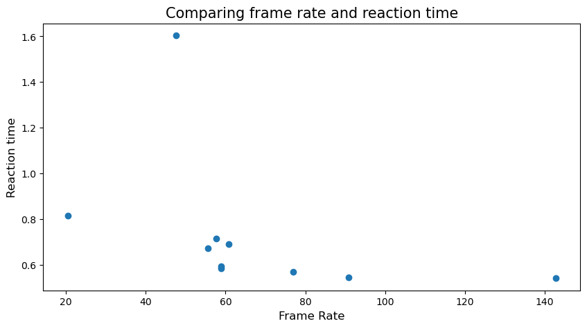
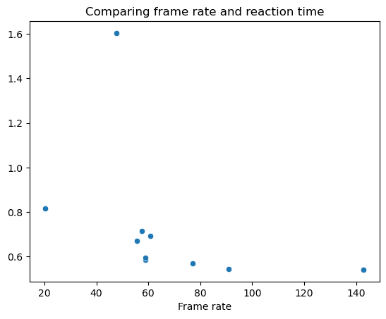
Nice, now we could also have a look at how meaningful values could interact using scatter plot. We want to check how the frame rate of the participant could affect the mean value of the reaction time of each participant. But for that, we need to learn groupby
📊 Introduction to groupby() in Pandas#
The .groupby() method in Pandas is used for grouping data based on a column or multiple columns and then applying aggregations (e.g., mean, sum, count).
Why Use groupby()?#
To summarize data by categories (e.g., average reaction time per participant).
To explore patterns and trends in grouped data.
To perform multi-level aggregations efficiently.
Common Aggregations with groupby():#
.mean()– Calculate the average value.sum()– Get the total value.count()– Count the number of rows.median()– Find the median value.std()– Calculate the standard deviation
GroupBy Workflow:#
Split: Group the data by unique values in a column.
Apply: Perform an aggregation or transformation on each group.
Combine: Return the results in a single DataFrame or Series.
🐼 Examples of groupby() in Pandas:#
# 1️⃣ Mean reaction time by participant:
mean_rt = df_long.groupby('participant')['resp.rt'].mean()

# 2️⃣ Multiple aggregations for reaction time:
mean_std_rt = df_long.groupby('participant').agg({'resp.rt': ['mean', 'std']})

print(mean_rt)
print(mean_std_rt)
participant
AG_01_02    0.814500
BF_31_01    0.691667
BF_31_02    0.714167
FB_09_02    0.584733
FB_09_03    0.594533
FK_24_01    1.603800
JB_22_01    0.541033
JB_22_02    0.569667
JB_22_03    0.545400
XY_16_03    0.671200
Name: resp.rt, dtype: float64
              resp.rt
                 mean       std
participant
AG_01_02     0.814500  0.227043
BF_31_01     0.691667  0.231659
BF_31_02     0.714167  0.202041
FB_09_02     0.584733  0.212847
FB_09_03     0.594533  0.198665
FK_24_01     1.603800  1.505703
JB_22_01     0.541033  0.140593
JB_22_02     0.569667  0.166234
JB_22_03     0.545400  0.168221
XY_16_03     0.671200  0.166866
# 3️⃣ Try to group by multiple columns (participant and congruent):
frameRate_list = df_long.drop_duplicates(subset='participant')['frameRate']
rt_list = df_long.groupby('participant')['resp.rt'].mean()

plt.figure(figsize=(10, 5))
plt.scatter(frameRate_list, rt_list)
plt.xlabel('Frame Rate', fontsize=12)
plt.ylabel('Reaction time', fontsize=12)
plt.title('Comparing frame rate and reaction time', fontsize=15)
plt.show()
Sometimes, we might want to have different subplots within one main plot. Using matplotlib’s subplots function makes this straightforward via two options: creating a subplot and adding the respective graphics or creating multiple subplots and adding the respective graphics via the axes. Let’s check the first option:
plt.subplot(1, 2, 1)
plt.hist(frameRate_list)
plt.xlabel('Frame Rate', fontsize=12)
plt.ylabel('Count', fontsize=12)
plt.title('Distribution of frame rate', fontsize=15)
plt.grid(True)

plt.subplots_adjust(right=4.85)

plt.subplot(1, 2, 2)
plt.scatter(frameRate_list, rt_list)
plt.xlabel('Frame Rate', fontsize=12)
plt.ylabel('Reaction time', fontsize=12)
plt.title('Comparing frame rate and reaction time', fontsize=15)
plt.show()
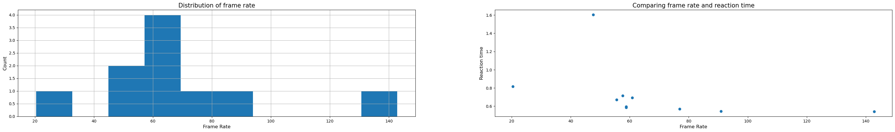
Hm, kinda ok but we would need to adapt the size and spacing. This is actually easier using the second option, subplots(), which is also recommended by the matplotlib community:
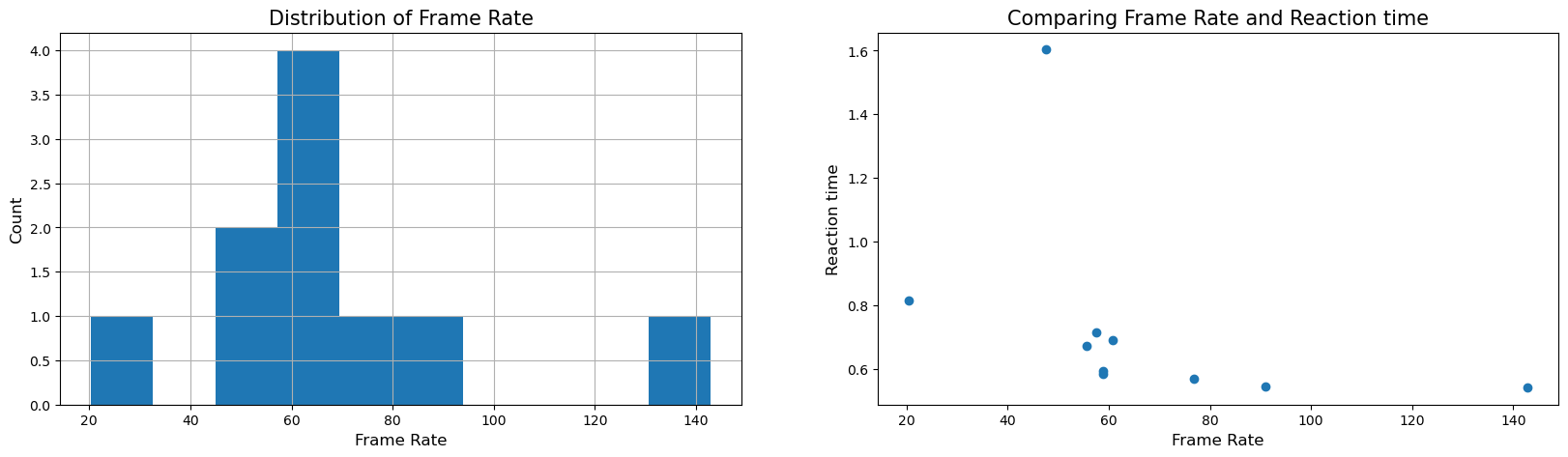
fig, axs = plt.subplots(1, 2, figsize=(20, 5))

axs[0].hist(frameRate_list)
axs[0].set_xlabel('Frame Rate', fontsize=12)
axs[0].set_ylabel('Count', fontsize=12)
axs[0].set_title('Distribution of Frame Rate', fontsize=15)
axs[0].grid(True)

axs[1].scatter(frameRate_list, rt_list)
axs[1].set_xlabel('Frame Rate', fontsize=12)
axs[1].set_ylabel('Reaction time', fontsize=12)
axs[1].set_title('Comparing Frame Rate and Reaction time', fontsize=15)
plt.show()
As matplotlib provides access to all parts of a figure, we could furthermore adapt various aspects, e.g. the color and size of the drawn markers.
fig, axs = plt.subplots(1, 2, figsize=(20, 5))

axs[0].hist(frameRate_list)
axs[0].set_xlabel('Frame Rate', fontsize=12)
axs[0].set_ylabel('Count', fontsize=12)
axs[0].set_title('Distribution of Frame Rate', fontsize=15)
axs[0].grid(True)

axs[1].scatter(frameRate_list, rt_list, c='black', s=80)
axs[1].set_xlabel('Frame Rate', fontsize=12)
axs[1].set_ylabel('Reaction time', fontsize=12)
axs[1].set_title('Comparing Frame Rate and Reaction time', fontsize=15)
axs[1].grid(True)
plt.show()

#Now its your turn! Try to plot hist plot for reaction time
#Now its your turn! Try to plot scatter plot for reaction time vs congruency
#Now its your turn! Try to boxplot reaction time on y-axis and condition on x-axis
# Group data by 'congruent' and create a list of 'resp.rt' values
# Collect reaction times based on congruency
congruent_0 = df_long[df_long['congruent'] == 0]['resp.rt'].values
congruent_1 = df_long[df_long['congruent'] == 1]['resp.rt'].values

# Combine into a list for boxplot
congruent_lists = [congruent_0, congruent_1]
# Create the boxplot
plt.figure(figsize=(8, 5))

plt.show()
This provides just a glimpse but matplotlib is infinitely customizable, thus as in most modern plotting environments, you can do virtually anything. The problem is: you just have to be willing to spend enough time on it. Lucky for us and everyone else there are many modules/libraries that provide a high-level interface to matplotlib. However, before we check one of them out we should quickly summarize pros and cons of matplotlib.
Pros#
provides low-level control over virtually every element of a
plotcompletely
object-oriented API;plotcomponents can be easily modifiedclose integration with
numpyextremely active community
tons of functionality (
figure compositing,layering,annotation,coordinate transformations,color mapping, etc.)
Cons#
steep learning curve
APIis extremely unpredictable–redundancy and inconsistency are commonsome simple things are hard; some complex things are easy
lacks systematicity/organizing
syntax–everyplotis its own little worldsimple
plotsoften require a lot ofcodedefault
stylesare not optimal
High-level interfaces to matplotlib#
matplotlibis very powerful and very robust, but theAPIis hit-and-missmany high-level interfaces to
matplotlibhave been writtenabstract away many of the annoying details
best of both worlds: easy generation of
plots, but retainmatplotlib’s powermany domain-specific
visualizationtools are built onmatplotlib(e.g.,nilearnandmneinneuroimaging)
Going further with advanced plots#
This also marks the transition to more “advanced plots” as the respective libraries allow you to create fantastic and complex plots with ease!
Seaborn#
Seaborn abstracts away many of the complexities to deal with such minutiae and provides a high-level API for creating aesthetic plots.
arguably the premier
matplotlibinterfaceforhigh-level plotsgenerates beautiful
plotsin very littlecodebeautiful
stylesandcolor paletteswide range of supported plots
modest support for structured
plotting(viagrids)exceptional documentation
generally, the best place to start when
exploringandvisualizing data(can be quite slow (e.g., with
permutation))
For example, recreating the plots from above is as easy as:
import seaborn as sns

sns.histplot(df_long.drop_duplicates(subset='participant')['age'])
plt.xlabel('Age')
plt.title('Distribution of age')
plt.show()
sns.scatterplot(x=frameRate_list.to_numpy(), y=rt_list.to_numpy())
plt.xlabel('Frame rate')
plt.title('Comparing frame rate and reaction time')
plt.show()
You might wonder: “well, that doesn’t look so different from the plots we created before and it’s also not way faster/easier”.
True that, but so far this based on our data and the things we wanted to plot. Seaborn actually integrates fantastically with pandas dataframes and allows to achieve amazing things rather easily.
Let’s go through some examples!
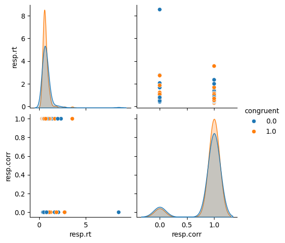
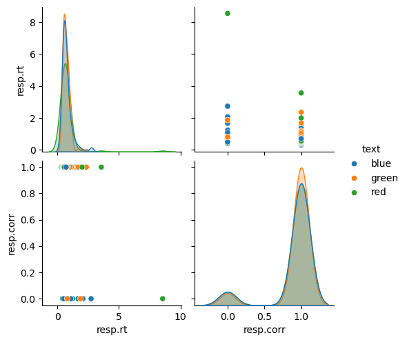
sns.pairplot(df_long[['resp.rt', 'resp.corr','congruent']], hue='congruent')
plt.show()
sns.pairplot(df_long[['resp.rt', 'resp.corr','text']], hue='text')
plt.show()
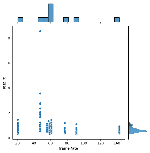
And can now make use of the fantastic pandas - seaborn friendship. For example, let’s go back to the scatterplot of frameRate and resp.rt we did before. How could we improve this plot? Maybe adding the distribution of each variable to it? That’s easily done via jointplot():
sns.jointplot(x='frameRate', y='resp.rt', data=df_long)
plt.show()
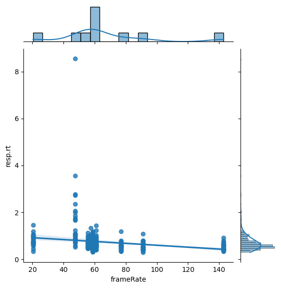
Wouldn’t it be cool if we could also briefly explore if there might be some statistically relevant effects going on here? Say no more, as we can add a regression to the plot via setting the kind argument to reg:
sns.jointplot(x='frameRate', y='resp.rt', data=df_long, kind='reg')
plt.show()
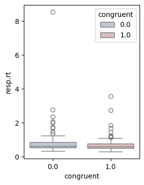
Chances are we see another manifestation of early onset grumpiness here and thus might want to spend a closer look on the ratings for each movie. One possibility to do so, could be a boxplot():
plt.figure(figsize=(3,4))
sns.boxplot(x='congruent', y='resp.rt', data=df_long, hue='congruent', palette="vlag")
plt.show()
#now its your turn! make boxplot for each text vs resp.rt
However, we know that boxplots have their fair share of problems…given that they show summary statistics, clusters and multimodalities are hidden..

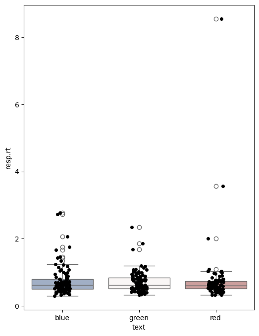
That’s actually one important aspect everyone should remember concerning data visualization, no matter if for exploration or analyses: show as much data and information as possible! With seaborn we can easily address this via adding individual data points to our plot via stripplot():
plt.figure(figsize=(6,8))
sns.boxplot(x='text', y='resp.rt', data=df_long, hue='text', palette="vlag")
sns.stripplot(x='text', y='resp.rt', data=df_long, color='black')
plt.show()
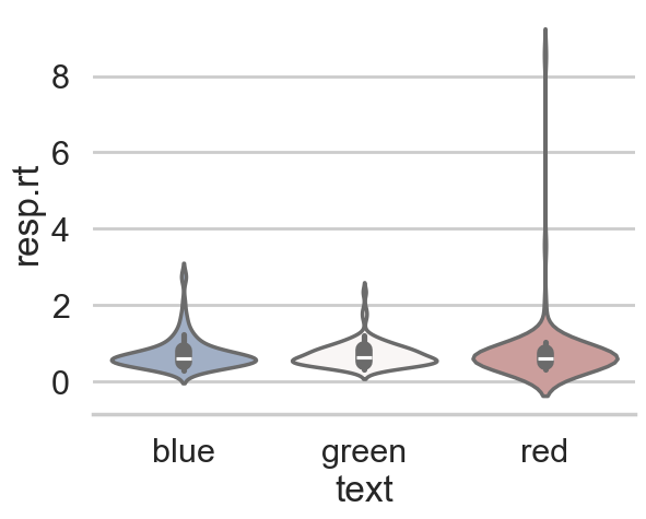
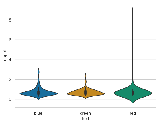
Ah yes, that’s better! Seeing the individual data points, we might want to check the respective distributions. Using seaborn’s violinplot(), this is done in no time.
plt.figure(figsize=(5,10))
sns.violinplot(x='text', y='resp.rt', data=df_long, hue='text', palette="vlag")
sns.despine()
plt.show()
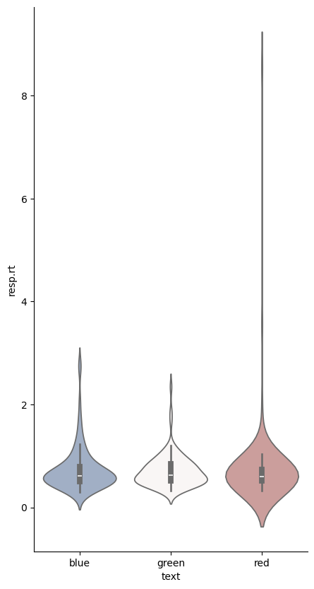
As you might have seen, we also adapted the style of our plot a bit via sns.despine() which removed the y axis spine. This actually outlines another important point: seaborn is fantastic when it comes to customizing plots with little effort (i.e. getting rid of many lines of matplotlib code). This includes “themes, contexts, colormaps among other things.
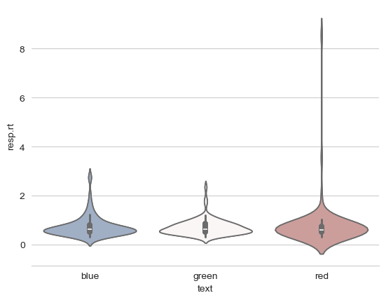
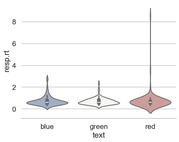
Starting with themes, which set a variety of aesthetic related factors, including background color, grids, etc., here are some very different examples showcasing the whitegrid style
sns.set_style("whitegrid")
sns.violinplot(x='text', y='resp.rt', data=df_long, hue='text', palette="vlag")
sns.despine(left=True)
plt.show()
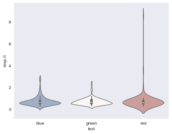
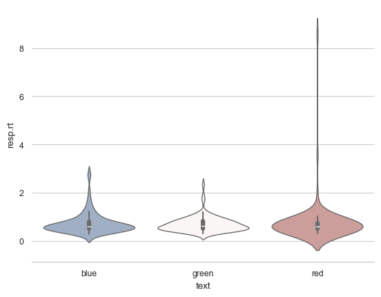
and the dark style:
sns.set_style("dark")
sns.violinplot(x='text', y='resp.rt', data=df_long, hue='text', palette="vlag")
sns.despine(left=True)
plt.show()
While this is already super cool, seaborn goes one step further and even let’s you define the context for which your figure is intended and adapts it accordingly. For example, there’s a big difference if you want to include your figure in a poster:
sns.set_style('whitegrid')
sns.set_context("poster")
sns.violinplot(x='text', y='resp.rt', data=df_long, hue='text', palette="vlag")
sns.despine(left=True)
plt.show()
or a talk:
sns.set_style("whitegrid")
sns.set_context("talk")
sns.violinplot(x='text', y='resp.rt', data=df_long, hue='text', palette="vlag")
sns.despine(left=True)
plt.show()
or a paper:
sns.set_context("paper")
sns.violinplot(x='text', y='resp.rt', data=df_long, hue='text', palette="vlag")
sns.despine(left=True)
plt.show()
No matter the figure and context, another very crucial aspect everyone should always look out for is the colormap or colorpalette! Some of the most common ones are actually suboptimal in multiple regards. This entails a misrepresentation of data:
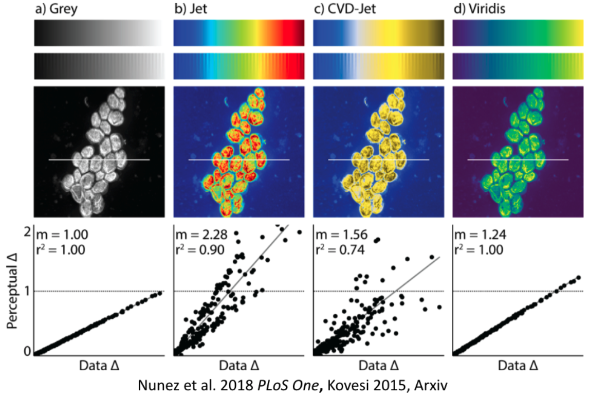
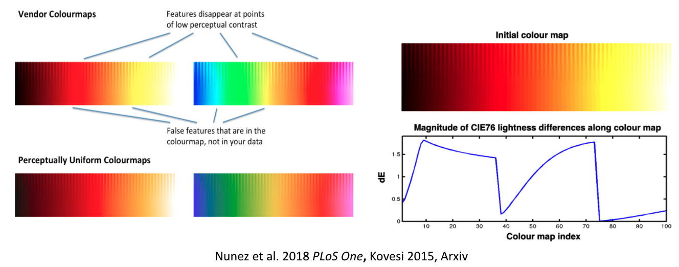
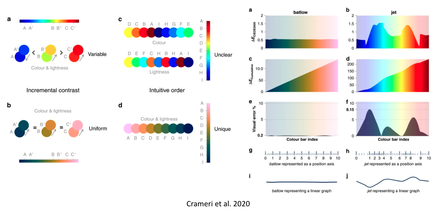
It gets even worse: they don’t work for people with color vision deficiencies!
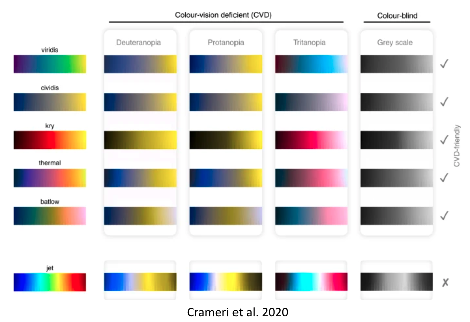
That’s obviously not ok and we/you need to address this! With seaborn, some of these important aspects are easily addressed. For example, via setting the colorpalette to colorblind:
sns.set_context("notebook")
sns.set_palette('colorblind')
sns.violinplot(x='text', y='resp.rt', data=df_long, hue='text')
sns.despine(left=True)
plt.show()
or using one of the suitable color palettes that also address the data representation problem, i.e. perceptually uniform color palettes:
sns.color_palette("flare", as_cmap=True)

sns.color_palette("crest", as_cmap=True)

sns.cubehelix_palette(as_cmap=True)

sns.cubehelix_palette(start=.5, rot=-.5, as_cmap=True)

Let’s see a few of those in action, for example within a heatmap that displays the correlation between ratings of movies. For this, we need to reshape our data back to wide-format which is straightforward using pandas’ pivot function.
# Pivot df_long to wide format
df_wide = df_long.pivot_table(
    index='participant',
    columns=['congruent', 'text', 'letterColor'],
    values='resp.rt',
    aggfunc='mean'  # Use mean if multiple values exist per condition
)
df_wide
| congruent | 0.0 | 1.0 | ||||
|---|---|---|---|---|---|---|
| text | blue | green | red | blue | green | red |
| letterColor | red | blue | green | blue | green | red |
| participant | ||||||
| AG_01_02 | 1.0116 | 1.0154 | 0.8174 | 0.7612 | 0.5682 | 0.7132 |
| BF_31_01 | 0.7160 | 0.7048 | 0.6294 | 0.7492 | 0.6210 | 0.7296 |
| BF_31_02 | 0.7150 | 0.8726 | 0.7404 | 0.6372 | 0.6338 | 0.6860 |
| FB_09_02 | 0.5958 | 0.4744 | 0.5816 | 0.6554 | 0.5906 | 0.6106 |
| FB_09_03 | 0.5774 | 0.6770 | 0.5604 | 0.6946 | 0.4944 | 0.5634 |
| FK_24_01 | 1.7914 | 1.0746 | 2.6864 | 1.3936 | 1.3048 | 1.3720 |
| JB_22_01 | 0.4814 | 0.6286 | 0.6164 | 0.4746 | 0.5226 | 0.5226 |
| JB_22_02 | 0.5252 | 0.6798 | 0.5054 | 0.5222 | 0.5902 | 0.5952 |
| JB_22_03 | 0.5910 | 0.6402 | 0.5164 | 0.5020 | 0.4728 | 0.5500 |
| XY_16_03 | 0.6842 | 0.7708 | 0.5328 | 0.6834 | 0.8144 | 0.5416 |
# Reset column names for clarity
df_wide.columns = [f'rt_congruent{c}_text{t}_color{col}' for c, t, col in df_wide.columns]
df_wide
| rt_congruent0.0_textblue_colorred | rt_congruent0.0_textgreen_colorblue | rt_congruent0.0_textred_colorgreen | rt_congruent1.0_textblue_colorblue | rt_congruent1.0_textgreen_colorgreen | rt_congruent1.0_textred_colorred | |
|---|---|---|---|---|---|---|
| participant | ||||||
| AG_01_02 | 1.0116 | 1.0154 | 0.8174 | 0.7612 | 0.5682 | 0.7132 |
| BF_31_01 | 0.7160 | 0.7048 | 0.6294 | 0.7492 | 0.6210 | 0.7296 |
| BF_31_02 | 0.7150 | 0.8726 | 0.7404 | 0.6372 | 0.6338 | 0.6860 |
| FB_09_02 | 0.5958 | 0.4744 | 0.5816 | 0.6554 | 0.5906 | 0.6106 |
| FB_09_03 | 0.5774 | 0.6770 | 0.5604 | 0.6946 | 0.4944 | 0.5634 |
| FK_24_01 | 1.7914 | 1.0746 | 2.6864 | 1.3936 | 1.3048 | 1.3720 |
| JB_22_01 | 0.4814 | 0.6286 | 0.6164 | 0.4746 | 0.5226 | 0.5226 |
| JB_22_02 | 0.5252 | 0.6798 | 0.5054 | 0.5222 | 0.5902 | 0.5952 |
| JB_22_03 | 0.5910 | 0.6402 | 0.5164 | 0.5020 | 0.4728 | 0.5500 |
| XY_16_03 | 0.6842 | 0.7708 | 0.5328 | 0.6834 | 0.8144 | 0.5416 |
#wow thats cool! can you try to do similar to resp.corr? but use date as index, and aggregate by congruent and corrAns
Then we can use another built-in function of pandas dataframes: .corr(), which computes a correlation between all columns:
plt.figure(figsize=(10,7))
sns.heatmap(df_wide.corr(), xticklabels=True, cmap='rocket')
plt.show()
<Figure size 1000x700 with 0 Axes>
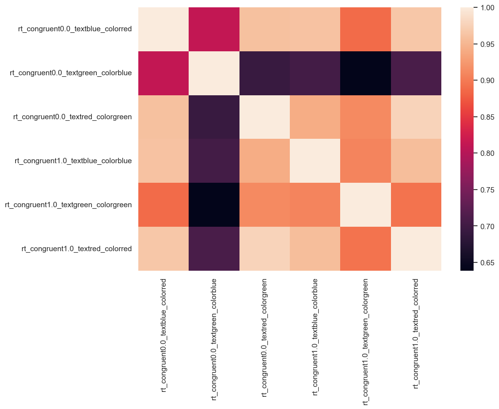
df_wide.corr()
| rt_congruent0.0_textblue_colorred | rt_congruent0.0_textgreen_colorblue | rt_congruent0.0_textred_colorgreen | rt_congruent1.0_textblue_colorblue | rt_congruent1.0_textgreen_colorgreen | rt_congruent1.0_textred_colorred | |
|---|---|---|---|---|---|---|
| rt_congruent0.0_textblue_colorred | 1.000000 | 0.812087 | 0.959666 | 0.961608 | 0.887717 | 0.965283 |
| rt_congruent0.0_textgreen_colorblue | 0.812087 | 1.000000 | 0.692348 | 0.703376 | 0.638695 | 0.708970 |
| rt_congruent0.0_textred_colorgreen | 0.959666 | 0.692348 | 1.000000 | 0.940903 | 0.911372 | 0.976929 |
| rt_congruent1.0_textblue_colorblue | 0.961608 | 0.703376 | 0.940903 | 1.000000 | 0.907014 | 0.957430 |
| rt_congruent1.0_textgreen_colorgreen | 0.887717 | 0.638695 | 0.911372 | 0.907014 | 1.000000 | 0.893670 |
| rt_congruent1.0_textred_colorred | 0.965283 | 0.708970 | 0.976929 | 0.957430 | 0.893670 | 1.000000 |
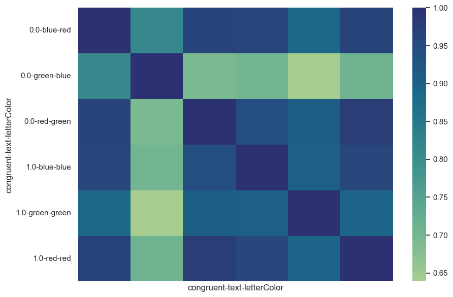
Nice, how does the crest palette look?
plt.figure(figsize=(10,7))
sns.heatmap(df_wide.corr(), xticklabels=False, cmap='crest')
plt.show()
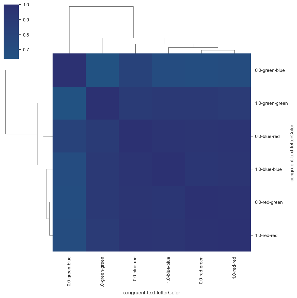
While we’re at it, we also change heatmap to clustermap!
plt.figure(figsize=(10,7))
sns.clustermap(df_wide.corr(), xticklabels=True, cmap='crest', center=0)
plt.show()
<Figure size 1000x700 with 0 Axes>
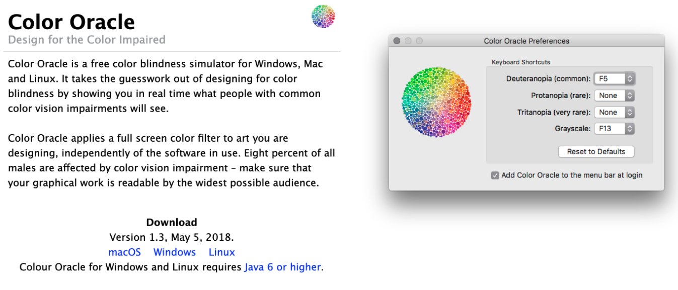
However, to be on the safe side, please also check your graphics for the mentioned points, e.g. via tools like Color Oracle that let you simulate color vision deficiencies!
Make use of amazing resources like the python graph gallery, the data to viz project and the colormap decision tree in Crameri et al. 2020, that in combination allow you to find and use the best graphic and colormap for your data!
And NEVER USE JET!

There appear to be some interesting effects we should investigate further which leads us to the grand finale: statistical analyses using python!
But before it one final test. We need to finally make meaningful plots!
First, create a new column which will have the words ‘congruent’ and ‘incongruent’ in corresponding rows
Use the plot of your choice to find whether there are any differences in RT and correct answers between congruent and incongruent trials
#work here
Now try to find if there is any relation between RT and trial number! Find a suitable plot for it
#work here
Statistics in python#
We’ve reached the final step of our analyses workflow: statistics, i.e. putting things to test via evaluating hypotheses and/or assumptions! As with the previous aspects, python has a lot of libraries and modules for this purpose, some general-domain and some rather tailored to specific data and analyzes (e.g. fMRI, EEG, drift diffusion models, etc.).
Here, we will stick with the general-domain ones as they are already support a huge amount of approaches and are commonly used by the community: pingouin and statsmodels. As before, we will go through several steps and explore respective python modules and functions.
Descriptive analyses#
Regarding the first aspect, descriptive analyses, we can safely state that we already know how to do this. For example using pandas or numpy and their respective functions:
print(df_long['resp.rt'].mean(), df_long['resp.rt'].std())
0.73307 0.5862532456143087
import numpy as np
print(np.mean(df_long['resp.rt']), np.std(df_long['resp.rt']))
0.73307 0.5852753412710977
for idx, df in df_long[['resp.rt', 'resp.corr','congruent']].groupby('congruent'):
    print('Summary statistics for: %s' %idx)
    print(df.describe())
Summary statistics for: 0.0
          resp.rt   resp.corr  congruent
count  150.000000  150.000000      150.0
mean     0.780460    0.893333        0.0
std      0.735391    0.309723        0.0
min      0.320000    0.000000        0.0
25%      0.514250    1.000000        0.0
50%      0.629000    1.000000        0.0
75%      0.838250    1.000000        0.0
max      8.553000    1.000000        0.0
Summary statistics for: 1.0
          resp.rt   resp.corr  congruent
count  150.000000  150.000000      150.0
mean     0.685680    0.920000        1.0
std      0.379962    0.272202        0.0
min      0.299000    0.000000        1.0
25%      0.509000    1.000000        1.0
50%      0.598500    1.000000        1.0
75%      0.750000    1.000000        1.0
max      3.564000    1.000000        1.0
Thus, we can skip these aspects here and directly move on! Regarding inferential analyses, we will start with and focus on pingouin!
Unfortunately not those…
but make sure to check https://www.penguinsinternational.org/ to see what you can do to help our amazing friends: the Penguins!
Inferential analyses#
Of course, exploring and visualizing data is informative and can hint at certain effects but we nevertheless have to run tests and obtain respective statistics to evaluate if there’s “something meaningful”. This is where inferential analyses come into play!
Pingouin#
Even though comparably new, Pingouin quickly became a staple regarding statistical analyses as it integrates amazingly well with the existing python data science stack, e.g. pandas and numpy. As mentioned in the docs: “Pingouin is designed for users who want simple yet exhaustive stats functions.”, which summarizes it perfectly as it supports the majority of commonly used statistical functions and additionally provides adjacent functionality, e.g. related to test diagnostics and evaluation:
ANOVAs:N-ways,repeated measures,mixed,ancovapairwise post-hocs tests(parametricandnon-parametric) andpairwise correlationsrobust,partial,distanceandrepeated measures correlationslinear/logisticregressionandmediation analysisBayes Factorsmultivariate testsreliabilityandconsistencyeffect sizesandpower analysisparametric/bootstrappedconfidence intervalsaround aneffect sizeor acorrelation coefficientcircular statisticschi-squared testsplotting:Bland-Altman plot,Q-Q plot,paired plot,robust correlation…
When in doubt, make sure to check if pingouin has your back!
One of the first things we explored via the previous analyses steps was if the ratings vary as a function of age. While the plots suggested at some potential effects, we can simply compute their correlation using pingouin’s corr function:
import pingouin as pg
pg.corr(frameRate_list, rt_list)
| n | r | CI95% | p-val | BF10 | power | |
|---|---|---|---|---|---|---|
| pearson | 10 | -0.41001 | [-0.83, 0.3] | 0.239279 | 0.717 | 0.225217 |
Not only do we get the correlation value and p value but also the number of observations, the 95% CI, Bayes Factor and the power. Pretty convenient, eh?
Using heatmap and clustermaps we also evaluate the correlation pattern of different conditions. In order to put some more numbers on that, we can make use of the mentioned pingouin - pandas friendship and compute multiple pairwise correlations based on the columns of a dataframe:
df_cor = pg.pairwise_corr(df_wide, method='pearson')
df_cor.head()
| X | Y | method | alternative | n | r | CI95% | p-unc | BF10 | power | |
|---|---|---|---|---|---|---|---|---|---|---|
| 0 | rt_congruent0.0_textblue_colorred | rt_congruent0.0_textgreen_colorblue | pearson | two-sided | 10 | 0.812087 | [0.37, 0.95] | 0.004319 | 13.317 | 0.874392 |
| 1 | rt_congruent0.0_textblue_colorred | rt_congruent0.0_textred_colorgreen | pearson | two-sided | 10 | 0.959666 | [0.83, 0.99] | 0.000011 | 1284.587 | 0.999531 |
| 2 | rt_congruent0.0_textblue_colorred | rt_congruent1.0_textblue_colorblue | pearson | two-sided | 10 | 0.961608 | [0.84, 0.99] | 0.000009 | 1490.035 | 0.999631 |
| 3 | rt_congruent0.0_textblue_colorred | rt_congruent1.0_textgreen_colorgreen | pearson | two-sided | 10 | 0.887717 | [0.59, 0.97] | 0.000606 | 60.022 | 0.970876 |
| 4 | rt_congruent0.0_textblue_colorred | rt_congruent1.0_textred_colorred | pearson | two-sided | 10 | 0.965283 | [0.86, 0.99] | 0.000006 | 2016.543 | 0.999777 |
We get a dataframe in return, which we can then use for further analyses. For example, as we did run quite a few tests, we might want to correct our p values for multiple comparisons. Obviously, pingouin also makes this super easy via it’s multicomp function which returns an list with True/False booleans and corrected p values:
df_cor['p_corr'] = pg.multicomp(df_cor['p-unc'].to_numpy(), method='bonf')[1]
df_cor.head()
| X | Y | method | alternative | n | r | CI95% | p-unc | BF10 | power | p_corr | |
|---|---|---|---|---|---|---|---|---|---|---|---|
| 0 | rt_congruent0.0_textblue_colorred | rt_congruent0.0_textgreen_colorblue | pearson | two-sided | 10 | 0.812087 | [0.37, 0.95] | 0.004319 | 13.317 | 0.874392 | 0.064781 |
| 1 | rt_congruent0.0_textblue_colorred | rt_congruent0.0_textred_colorgreen | pearson | two-sided | 10 | 0.959666 | [0.83, 0.99] | 0.000011 | 1284.587 | 0.999531 | 0.000165 |
| 2 | rt_congruent0.0_textblue_colorred | rt_congruent1.0_textblue_colorblue | pearson | two-sided | 10 | 0.961608 | [0.84, 0.99] | 0.000009 | 1490.035 | 0.999631 | 0.000136 |
| 3 | rt_congruent0.0_textblue_colorred | rt_congruent1.0_textgreen_colorgreen | pearson | two-sided | 10 | 0.887717 | [0.59, 0.97] | 0.000606 | 60.022 | 0.970876 | 0.009090 |
| 4 | rt_congruent0.0_textblue_colorred | rt_congruent1.0_textred_colorred | pearson | two-sided | 10 | 0.965283 | [0.86, 0.99] | 0.000006 | 2016.543 | 0.999777 | 0.000091 |
Now please compute something more “meaningful” like correlation between frame rate, reaction time and trial number
adjust p value using holm method
add column which shows True if p value is significant and False if not
# work here
We can reformulate our analyses to an regression problem and thus run a multiple regression via pingouin’s linear_regression function:
movie_reg = pg.linear_regression(df_long['resp.rt'], df_long['trial_number'])
movie_reg
| names | coef | se | T | pval | r2 | adj_r2 | CI[2.5%] | CI[97.5%] | |
|---|---|---|---|---|---|---|---|---|---|
| 0 | Intercept | 16.499060 | 0.800194 | 20.618833 | 2.589562e-59 | 0.008492 | 0.005165 | 14.924313 | 18.073806 |
| 1 | resp.rt | -1.362844 | 0.853039 | -1.597634 | 1.111843e-01 | 0.008492 | 0.005165 | -3.041587 | 0.315900 |
Which would again provide a very exhaustive and intelligible output that can easily be utilized further.
One of the outputs of the regression reminds us of “a very low hanging fruit” we haven’t checked yet: T-Tests! Lets finally test the usual Stroop hypothesis!
That’s right: testing statistical premises/test assumptions! In other words: we need to evaluate if the assumptions/requirements for a parametric test, like the T-Test are fulfilled or if we need to apply a non-parametric test.
At first, we are going to test the distribution of our data. Often folks assume that their data follows a gaussian distribution, which allows for parametric tests to be run. Nevertheless it is essential to first test the distribution of your data to decide if the assumption of normally distributed data holds, if this is not the case we would have to switch to non-parametric tests.
With pingouin this is again only one brief function away. Here specifically, the normality() function that implements the Shapiro Wilk normality test:
pg.normality(df_long['resp.rt'])
| W | pval | normal | |
|---|---|---|---|
| resp.rt | 0.418217 | 5.602158e-30 | False |
#now check the same for correct reports!
Not, so good, but for learning purposes lets continue with T-test.
By now you might know that pingouin obviously has a dedicated function for this and of course you’re right: ttest:
pg.ttest(df_long[df_long['congruent']==1]['resp.rt'], df_long[df_long['congruent']==0]['resp.rt'], paired=True)
| T | dof | alternative | p-val | CI95% | cohen-d | BF10 | power | |
|---|---|---|---|---|---|---|---|---|
| T-test | -1.629319 | 149 | two-sided | 0.105358 | [-0.21, 0.02] | 0.161932 | 0.331 | 0.50423 |
Since we are working with paired t-test, there is a dedicated function which makes everything easier!
pg.pairwise_tests(
    data=df_long,
    dv='resp.rt',
    between=None,
    within='congruent',
    subject='participant'
)
| Contrast | A | B | Paired | Parametric | T | dof | alternative | p-unc | BF10 | hedges | |
|---|---|---|---|---|---|---|---|---|---|---|---|
| 0 | congruent | 0.0 | 1.0 | True | True | 1.774183 | 9.0 | two-sided | 0.10978 | 0.987 | 0.275808 |
But we have different results? Why? Which one is correct?
We can actually make another version correct as well
# Align data by participant (only participants with both conditions)
df_paired = df_long.pivot_table(
    index='participant',
    columns='congruent',
    values='resp.rt'
).dropna()

# Perform the paired t-test
pg.ttest(
    x=df_paired[1],
    y=df_paired[0],
    paired=True
)
| T | dof | alternative | p-val | CI95% | cohen-d | BF10 | power | |
|---|---|---|---|---|---|---|---|---|
| T-test | -1.774183 | 9 | two-sided | 0.10978 | [-0.22, 0.03] | 0.287976 | 0.987 | 0.129216 |
If we however wanted to run a non-parametric test, here a wilcoxon test, we can do so without problems:
pg.wilcoxon(x=df_paired[1], y=df_paired[0])
| W-val | alternative | p-val | RBC | CLES | |
|---|---|---|---|---|---|
| Wilcoxon | 10.0 | two-sided | 0.083984 | -0.636364 | 0.43 |
# now check whats going on with correct reports!
While we could now go through each comparison of interest, we might want to approach the analyses from a different angle. For example, starting with an anova comparing ratings between text:
pg.rm_anova(data=df_long, dv='resp.rt', within='text', subject='participant', detailed=True)
| Source | SS | DF | MS | F | p-unc | p-GG-corr | ng2 | eps | sphericity | W-spher | p-spher | |
|---|---|---|---|---|---|---|---|---|---|---|---|---|
| 0 | text | 0.010958 | 2 | 0.005479 | 0.241367 | 0.788055 | 0.664249 | 0.003477 | 0.569127 | False | 0.242924 | 0.003482 |
| 1 | Error | 0.408595 | 18 | 0.022700 | NaN | NaN | NaN | NaN | NaN | NaN | NaN | NaN |
Usually the next step would be to run post-hoc tests contrasting each pair of categories. Once more pingouin comes to the rescue and implements this in just one function within which we can additionally define if we want to run a parametric test, if p values should be adjusted and what kind of effect size we would like to have:
pg.pairwise_tests(data=df_long, dv='resp.rt', within='text', subject='participant',
                             parametric=True, padjust='bonf', effsize='cohen')
| Contrast | A | B | Paired | Parametric | T | dof | alternative | p-unc | p-corr | p-adjust | BF10 | cohen | |
|---|---|---|---|---|---|---|---|---|---|---|---|---|---|
| 0 | text | blue | green | True | True | 0.621562 | 9.0 | two-sided | 0.549648 | 1.0 | bonf | 0.364 | 0.114903 |
| 1 | text | blue | red | True | True | -0.295968 | 9.0 | two-sided | 0.773970 | 1.0 | bonf | 0.321 | -0.039105 |
| 2 | text | green | red | True | True | -0.499229 | 9.0 | two-sided | 0.629593 | 1.0 | bonf | 0.343 | -0.131297 |
Isn’t pingouin just fantastic? Especially considering that the many things we explored only cover a small percentage of available functionality as we didn’t even look at e.g. mediation analyses, contingency analyses, multivariate tests, reliability, etc. . However, you should have got an idea how powerful and versatile pingouin is for the majority of analyses you commonly run.
NB 1: A small note before we continue: a lot of these “standard analyses” and more are also implemented in the scipy.stats module which is might be interesting if there’s something you want to run that is implemented pingouin.
NB 2: we focused on pingouin because of it’s large amount of functions, great integration with pandas and high-level API.
Even though it’s a virtual class I can literally hear folks yell: “What about formulas? I need to define formulas!”.
Don’t you worry a thing: while this is (yet) not possible in pingouin, there’s of course a different python module that can do these things. Open your hearts for statsmodels!
Statsmodels#
statsmodels (sorry no animal pun, don’t know why) is yet another great python module for statistical analyses. In contrast to pingouin it focuses on rather complex and more specialized analyses:
regressiondiscrete choice modelsGeneralized Estimating Equationsmeta-analysestime-series,forecastingstate space modelsetc.
In order to provide a brief glimpse of how statsmodels can be used to define and apply statistical models via formulas, we will check two examples and while doing so ignoring the reasonableness. At first we will import the formula.api:
import statsmodels.formula.api as smf
Which can then be used to define and run statistical models. Independent of the specific model the outline is roughly identical: a model is defined via a string e.g. referencing the columns/variables of a dataframe and then fitted. Subsequently, all aspects of the model can be accessed. For example, a simple linear regression via an ordinary least squares would look like the following:
df_long['rt']=df_long['resp.rt']
md = smf.ols("rt ~ trial_number", df_long).fit()
Using the .summary() function we can then get a holistic overview of the model and the outcomes:
print(md.summary())
                            OLS Regression Results
==============================================================================
Dep. Variable:                     rt   R-squared:                       0.008
Model:                            OLS   Adj. R-squared:                  0.005
Method:                 Least Squares   F-statistic:                     2.552
Date:                Thu, 13 Feb 2025   Prob (F-statistic):              0.111
Time:                        14:57:12   Log-Likelihood:                -263.70
No. Observations:                 300   AIC:                             531.4
Df Residuals:                     298   BIC:                             538.8
Df Model:                           1
Covariance Type:            nonrobust
================================================================================
                   coef    std err          t      P>|t|      [0.025      0.975]
--------------------------------------------------------------------------------
Intercept        0.8297      0.069     11.982      0.000       0.693       0.966
trial_number    -0.0062      0.004     -1.598      0.111      -0.014       0.001
==============================================================================
Omnibus:                      488.908   Durbin-Watson:                   1.486
Prob(Omnibus):                  0.000   Jarque-Bera (JB):           136970.679
Skew:                           8.591   Prob(JB):                         0.00
Kurtosis:                     106.259   Cond. No.                         36.5
==============================================================================

Notes:
[1] Standard Errors assume that the covariance matrix of the errors is correctly specified.
All displayed information is furthermore directly accessible:
md.bic
538.8083391527322
md.fvalue
2.552433103431772
md.resid
0     -0.188426
1     -0.475194
2     -0.169963
3      0.271268
4     -0.118500
         ...
295    0.047360
296   -0.173408
297   -0.141177
298   -0.100946
299    0.057286
Length: 300, dtype: float64
#try to extract p value!
If we also want to define and run a linear mixed effects model, we only need to change the model type to mixedlm and define our model accordingly:
md = smf.mixedlm("rt ~ congruent", df_long, groups=df_long["participant"])
mdf = md.fit()
print(mdf.summary())
         Mixed Linear Model Regression Results
=======================================================
Model:            MixedLM Dependent Variable: rt
No. Observations: 300     Method:             REML
No. Groups:       10      Scale:              0.2587
Min. group size:  30      Log-Likelihood:     -237.4849
Max. group size:  30      Converged:          Yes
Mean group size:  30.0
-------------------------------------------------------
             Coef.  Std.Err.   z    P>|z| [0.025 0.975]
-------------------------------------------------------
Intercept     0.780    0.105  7.448 0.000  0.575  0.986
congruent    -0.095    0.059 -1.614 0.107 -0.210  0.020
Group Var     0.093    0.095
=======================================================
Overall, there’s only one thing left to say regarding statistical analyses in python:

Outro/Q&A - visualization & statistics#
What we went through in this session was intended as a super small showcase of visualizing and analyzing data via python, specifically using a small subset of available modules which we only just started to explore and have way more functionality.
Sure: this was a very specific use case and data but the steps and underlying principles are transferable to the majority of comparable problems/tasks you might encounter. Especially because the modules we checked are commonly used and are usually the “go-to” option, at least as a first step. As always: make sure to check the fantastic docs of the python modules you’re using, as well as all the fantastic tutorials out there.
Outro/Q&A - working with data in python#
As mentioned in the beginning, there are so many options of working with data and setting up correspondingly workflows that vary as a function of data at hand and planned analyses. Finding the “only right option” might also not be possible in some cases.
The idea of this section of the course was to outline an example workflow based on some “real-world data” to showcase you some of the capabilities and things you can do using python. Specifically, once more making the case that python has module/library for basically everything you want to do, which are additionally rather straightforward and easy to use and come with comprehensive documentation, as well as many tutorials. This holds true for both domain-general and highly specialized use cases. From data exploration over visualization to analyses you will find a great set of resources that integrates amazingly well with one another and allow you to achieve awesome things in an intelligible and reproducible manner!
The core Python “data science” stack#
The Python ecosystem contains tens of thousands of packages
Several are very widely used in data science applications:
Jupyter: interactive notebooks
Numpy: numerical computing in Python
pandas: data structures for Python
Scipy: scientific Python tools
Matplotlib: plotting in Python
scikit-learn: machine learning in Python
We’ll cover the first three very briefly here
Other tutorials will go into greater detail on most of the others
The core “Python for psychology” stack#
The
Python ecosystemcontains tens of thousands ofpackagesSeveral are very widely used in psychology research:
Jupyter: interactive notebooks
Numpy: numerical computing in
Pythonpandas: data structures for
PythonScipy: scientific
PythontoolsMatplotlib: plotting in
Pythonseaborn: plotting in
Pythonscikit-learn: machine learning in
Pythonstatsmodels: statistical analyses in
Pythonpingouin: statistical analyses in
Pythonpsychopy: running experiments in
Pythonnilearn: brain imaging analyses in
Pythonmne: electrophysiology analyses in
Python
Execept
scikit-learn,nilearnandmne, we’ll cover all very briefly in this coursethere are many free tutorials online that will go into greater detail and also cover the other
packages